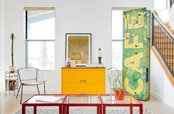
Stifling a yawn over symmetry? Shift your art arrangements for design drama that's anything but middling
Like most traditionalists, I gravitate toward symmetry. For a long time, my living room sideboard had a single framed black and white photo hanging over it, dead center. The scale of the photo was too small for its location, and every time I walked past it I puzzled over how to fill in the walls on either side. Sconces? Twin mirrors? Framed postcards? I was stuck.
Then, in the midst of a little recreational furniture rearranging, I had a brainstorm. I left the picture where it was but pushed the sideboard a foot to the left and plopped a stray table lamp at the bare end. What a difference! Even without fine-tuning, the composition — and the room — gained instant energy and tension. And the simple fix reminded me of a basic principle that I tend to forget: Sometimes artwork looks better off center.
Hanging art is such a complex subject that writers have spent pages and pages explaining it. But one of the fundamentals is to consider a piece's relationship to its surroundings, not just the immediate area where it will hang. As in my case, that may mean mounting it to the left or right of a piece of furniture, or in an odd patch of wall space that cries out to be put to use. Not only does this invigorate a space, but it also engages the eye and keeps the gaze moving.
Take a look at how off-kilter art enlivens these spaces. Have you taken this approach in your home? Share a photo in the Comments section.
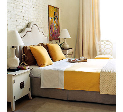
I would never have thought to hang this piece in its spot to the right of the bed, and yet when I look at the room, I can't imagine it anywhere else. Its placement bridges the gap between the headboard and draperies and lends a needed touch of height.
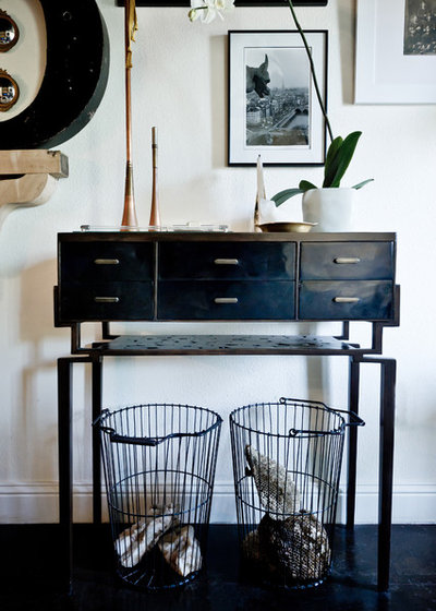
This is a perfect example of the relationship between art and the other elements in a space. With the strong black console and wall sculpture, the composition needed a little negative space to keep from reading as too heavy. Yet a single photo or painting centered over the table would have looked lost. The solution? A group of several works arranged in a way that creates fluidity and leaves breathing room, but still holds its own.
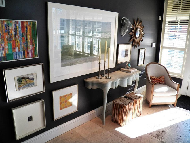
Can you picture a teeny-tiny piece of art hung over the console in this space? Neither can I. The oversize picture that anchors the gallery wall balances the modest scale of the furniture, and the staggered placement leads the eye along the surface.
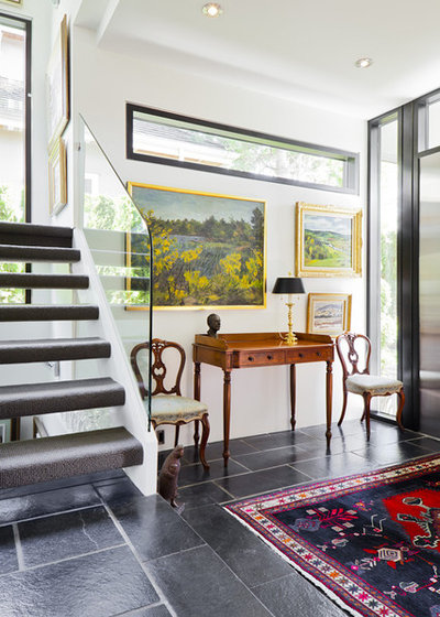
Similarly, this petite console and chairs would feel too timid against a big, blank stretch of wall. Off-center art swallows some of the bare space and connects the furniture with the horizontal window near the ceiling.
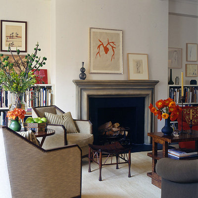
On its own, each of the works above the mantel would be too small to fill that slice of wall. The solution? Elevate one, then prop the other to create a sense of motion and even out the visual weight.
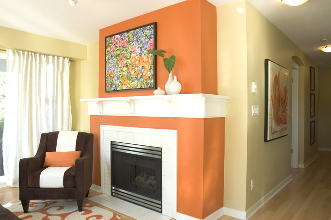
In this case a grouping of vases offsets a painting that's been shifted to the left. The placement plays up the energy of the bright orange fireplace and keeps the architecture from feeling static.
These homeowners could have mounted the smaller pieces on either side of the larger one and called it a day. But switching up the order tilts the balance of the space and adds a quirkier sensibility.
you have an architectural element that demands attention, try hanging art where it won't compete. This quartet of pictures aligns with the asymmetrical fireplace rather than the mantel.
In an eclectic space where nothing matches, would you expect to find a piece of art mounted precisely over the middle of a chest? Of course not. Scooting it just a smidge to the left yields a pleasing graduated-height effect. This is a lot like what I did in my living room — though my lamp is nowhere near as cool as that lava version.

